
2·
2 months agoThe Akkoma instance hosted on kernel.org
https://social.kernel.org/notice/AWSXomDbvdxKgOxVAm
The Akkoma instance hosted on kernel.org
https://social.kernel.org/notice/AWSXomDbvdxKgOxVAm
No part of open source puts value in collaboration and democratising the means of the production. Free software is definitely not about reducing inherent contradictions and exploitation that arise from your livelihood being dependant on someone else’s private property.
Though sometimes you get confused randos like this saying stuff they don’t understand, probably where the confusion stems from.
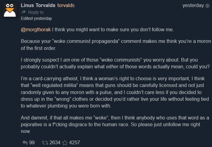
Communism and Linux are completely unrelated.
A school? One? There’s one school? Don’t all schools use Linux?
What’s your reservation with Sideberry?
In all the most read languages, text is read most easily horizontally. That means that if you want to be able to read the tab titles, they need to be very wide. If they are stacked on top of each other, they can have a fixed width that you’re willing to sacrifice, and then you can read the titles easily and scroll through them quickly. They pack very tight (one line) vertically. They don’t compress as much horizontally while keeping the titles legible. Using only icons and packing them tight is hard to parse, because horizontal lists are harder to parse than vertical lists.
Further, because monitors are so wide, even one line (and especially one line with all the padding that is required for a UI element to be comfortable to parse) spanning the entire width of the monitor is a felt sacrifice. The width of a normal website title sacrificed horizontally for the entire height of the window on the other hand isn’t felt as strongly.
I don’t know the methodology, but this article from about a year ago estimated 40 million Ubuntu users. https://www.bleepingcomputer.com/news/security/almost-40-percent-of-ubuntu-users-vulnerable-to-new-privilege-elevation-flaws/
Which compares to what, 2 million Steam Deck sales? 3 million? And how many of them remain active users? Doubt it’s even double digit percent.
That tweet is so weak, how are hundreds of people here upvoting and commenting on this?
I used to use Gnome with a tiled window manager. It was a good combo. Don’t see why they have to be exclusive. No hate from my side, KDE and Gnome are both incredible. I can spare some hate for the Gnome-haters though.